Anatomy of a Product Page for eCommerce to Generate Sales
Ever wondered why some product pages rake in sales while others barely make a blip on the radar? It’s all in the anatomy of the page.
In the bustling digital marketplace, your product page isn’t just a place to park your products; it’s a dynamic sales machine, a conversion powerhouse, and yes, the make-or-break point for your online store.
Did you know that a whopping 98% of visitors, on average, don’t make a purchase during their first visit to an ecommerce site? Source: Inc.com
It’s not because they aren’t interested; it’s often because the ecommerce product page failed to ignite that spark of “I need this!”
So, what’s the secret sauce to turn those product page visits into ringing cash registers?
That’s exactly what we’re diving into today. We’re rolling up our sleeves to dissect the anatomy of a killer ecommerce product page, pinpoint those pesky challenges that are costing you sales, and arm you with tried-and-tested solutions to supercharge your conversion rates.
Whether you’re a seasoned ecommerce veteran looking to refine your game or a newbie stepping into the exciting world of online sales, this comprehensive guide is your ticket to transforming your product pages into conversion magnets.
Ready to unlock the secrets? Let’s jump right in!
Current Product Page Challenges
Poor User Experience
Alright, let’s get real for a moment. We’ve all been there – landing on a product page that feels like a maze.
Cluttered design, confusing navigation, and let’s not even get started on those slow-loading images. It’s a quick click to that ‘back’ button, isn’t it?
In fact, studies show that 38% of people will stop engaging with a website if the content or layout is unattractive.
Lack of Information
And here’s another curveball – the ghost town product pages. You know the ones, with just a picture and a price, leaving us with a cartload of questions and zero answers.

A poor experience on an eCommerce product page can lead to lost sales, increased cart abandonment rates, and a damaged brand reputation.
It’s like walking into a store and finding no one around to tell you if that shirt comes in any other color or if those sneakers are true to size. Frustrating, isn’t it?
Ineffective SEO
Now, let’s sprinkle in some SEO woes. Imagine having a killer product but it’s buried deep in the abyss of Google’s search results.
It’s like having a billboard in the desert. Pointless, right? Over 67% of all clicks go to the first five organic results.
If your product page isn’t SEO optimized, you’re not just losing traffic; you’re handing over potential customers to the competition on a silver platter.
Solutions
Enhanced User Experience
But worry not! There’s light at the end of this tunnel. Transforming that chaotic product page into a sleek, user-friendly masterpiece is more doable than you think.
Think intuitive design, seamless navigation, and lightning-fast load times.
It’s about creating a virtual aisle that’s as inviting and navigational as a walk through your favorite store.
Rich Information
And let’s bid farewell to those barren product pages. It’s time to usher in the era of rich, informative, and engaging content.
We’re talking detailed product descriptions, a buffet of images from every angle, and perhaps even a video that brings the product to life.
Every question answered, every doubt alleviated – right there on the page.
SEO Optimization
SEO, the three letters that can make or break your online presence.
But fret not, with the right keywords, meta tags, and content optimization, that coveted spot on Google’s first page is well within reach.
It’s not just about visibility; it’s about making your product page the obvious choice amidst a sea of options.
Product Presentation with SEO
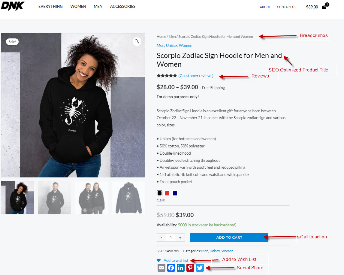
Enticing Titles
Now, let’s jazz things up with titles that are not just eye-catching but are also SEO goldmines.
Imagine a title that’s a harmonious blend of key phrases and compelling language, making both Google and your potential customers fall head over heels.
Engaging Descriptions
And we’re not stopping there. Every word of the product description is a golden opportunity to woo the customer and please the search engines.
It’s an art and a science, where keywords meet compelling storytelling, leading the customer effortlessly from ‘just browsing’ to ‘take my money!’
Images and Videos
A picture is worth a thousand words, but a video? That’s a whole novel. In the ecommerce world, visual content isn’t just king; it’s the entire kingdom.
High-res images, 360-degree views, engaging videos – it’s about making the customer see, feel, and almost touch the product, all while boosting that SEO score.
Call to Action
Alright, let’s shift gears and talk about something that’s as crucial as the air we breathe – the Call to Action (CTA). Ever landed on a product page, got all excited, and then found yourself playing hide and seek with the “buy now” button? Annoying, isn’t it?
A staggering 70% of small business websites lack a Call to Action on their homepage, let alone product pages. But not you, not after today.
Language and Design
We’re crafting CTAs that are as visible as the noon sun and as enticing as a Black Friday sale.
It’s a blend of compelling language and eye-catching design, a button that’s not just seen but begs to be clicked.
It’s where the magic of copywriting marries the allure of design, leading to a match made in conversion heaven.
Social Proof
Now, let’s sprinkle some trust into the mix with the golden touch of social proof. Imagine a customer teetering on the edge of purchase.
What tips them over? Hearing the cheers of those who’ve walked this path before.
A whopping 91% of millennials trust online reviews as much as friends and family.
So, we’re not just adding reviews; we’re making them a centerpiece, a testament to the awesomeness of your product.
Testimonials
And it doesn’t stop at star ratings. We’re bringing in testimonials, stories of happy customers, pictures of them using and loving your product. I
t’s a narrative that transforms a product page into a community, a place where every visitor is welcomed with open arms and ushered into the fold.
View Product Page Demo Example
Showcase Credentials
Certifications and Awards
In the world of ecommerce, trust isn’t given; it’s earned. And what better way to earn it than flaunting those badges of honor? Be it certifications, awards, or recognitions, we’re not just showcasing them; we’re making them a narrative, a story of your commitment to excellence and quality.
Trust Badges
And oh, those trust badges! They’re not just logos; they’re seals of assurance, a silent nod that says, “You’re in safe hands.”
In fact, trust badges can increase conversion rates by a staggering 42%. So, we’re placing them strategically, making every visitor’s journey from contemplation to purchase a walk in the garden of assurance.
Timing and Content
It’s not about bombarding; it’s about enticing. Every word, every design element is crafted to not just retain but to re-engage, turning a moment of exit into a moment of re-consideration, and eventually, purchase.
Upsells
And just when you thought it couldn’t get any better, enter the world of upsells. Imagine a customer, happy with their purchase, and just then, they spot something else, something that complements their buy, something they didn’t know they needed until this very moment.
That’s the magic of strategically placed product recommendations, a nudge that sweetly whispers,
“Why stop here?”
Bundling
And we’re making this magic with bundles, packages that are not just attractive but are irresistible. It’s an art and a science, where analytics meets intuition, leading to bundles that feel personalized, curated, and oh-so-tempting.
Other Elements to Consider
Clear Return Policy
Hold on, we’re not done yet! There’s another gem that often slips through the cracks but is a game-changer – a clear, straightforward return policy. Ever hesitated to hit that ‘buy’ button, wondering what if it doesn’t fit, or what if it’s not what you expected? You’re not alone. A clear return policy eliminates this uncertainty, giving customers the confidence to take the plunge. In fact, 49% of shoppers check the return policy before making a purchase online. So, let’s make yours not just visible but a testament to your commitment to customer satisfaction.
Contact Information
In the digital world, a touch of the tangible goes a long way. Your address, phone number, and customer support details aren’t just information; they’re assurance, a reminder that behind the digital façade, there’s a real team, ready to assist, support, and walk the journey with the customer. It’s a bridge that connects the digital to the real, instilling confidence and trust.
FAQs
And let’s not forget the humble FAQ section, often overlooked but a silent warrior in enhancing user experience. It’s not just about answering questions; it’s about anticipating them, addressing concerns before they even arise, making the journey from browsing to purchasing seamless, effortless, and enjoyable. Every FAQ is an opportunity to eliminate doubts, build confidence, and showcase your commitment to transparency and customer satisfaction.
So, there you have it, the anatomy of a product page that doesn’t just attract but converts, retains, and turns customers into loyal advocates. It’s a journey from the first glance to the final checkout, every step, every element, meticulously crafted to enhance, entice, and elevate.
Next steps: Evaluate your product page and determine its effectiveness in engaging customers and driving sales. Use this guide to identify and enhance key elements like layout, imagery, content quality, and call-to-action placements, turning your page into a digital sales machine 🙂

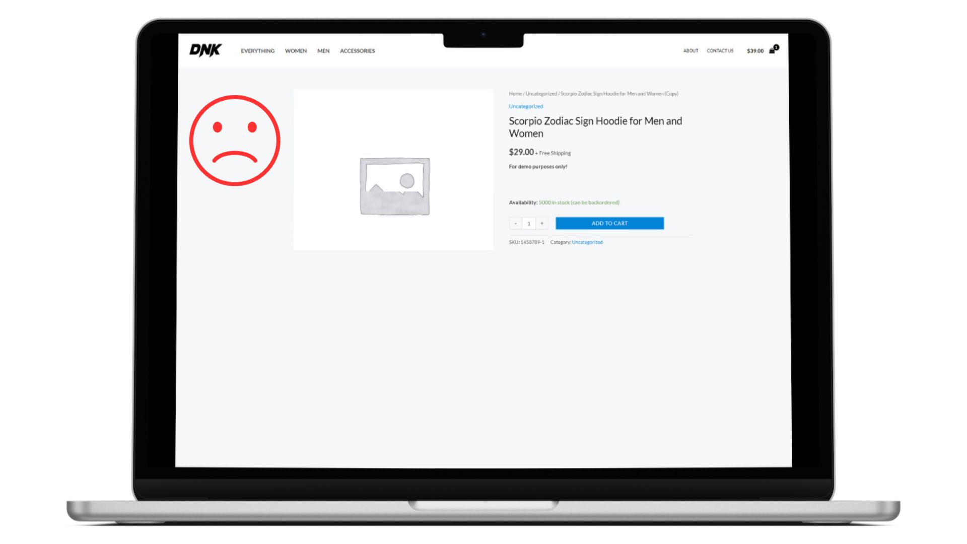
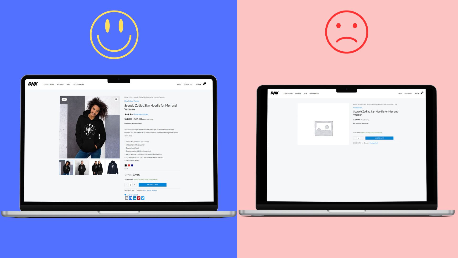
Optimized vs non-optimized product page for an eCommerce website: Which category does your page fall into?
Attention business owners and operators!
Want to skyrocket your sales? Let us be your partner in growth. We offer a comprehensive, mobile-friendly, SEO-optimized eCommerce solution that includes:
– A responsive website design
– Seamless shopping cart experience
– Smooth checkout with integrated payments & eHopper POS
– Efficient CRM system
– Newsletter & SMS subscription tools
– Expert digital marketing guidance
– AI-driven content creation
Plus, enjoy secure hosting, SSL, and a waived setup fee (a $2,500 value!).
Whether you’re in retail, dining, legal, medical, or any other industry, we’ve got you covered.
Don’t miss out on this opportunity to elevate your business.
Schedule a FREE demo now and see the difference for yourself!


